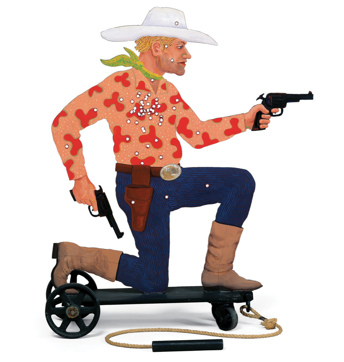
 The Apache Pull-Toy is posing a problem. The wheeled, painted-steel figure (1988) by Native American artist Bob Haozous of a kneeling, pistol-brandishing blond cowboy has been placed alongside a glass-walled staircase in a second-floor gallery of the new Hood Museum of Art. But something isn’t working.
A gaggle of employees stands nearby. “It looks a little busy here with the railing,” offers exhibitions staffer John Reynolds. Exasperation hangs in the silence until John Stomberg, the museum’s director, quips: “Eh, we’ll just pull it around until we find the right place,” and the group lets out a guffaw.
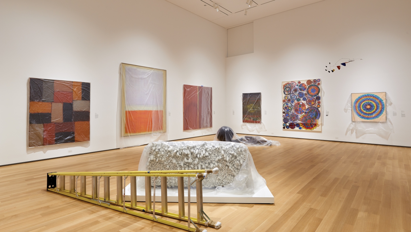
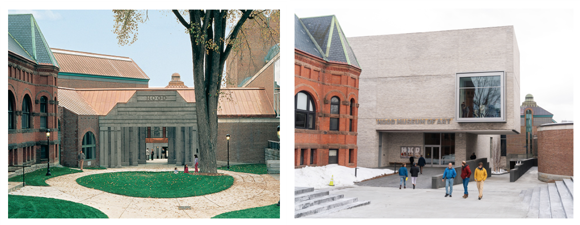
It’s been more than two years since the Hood shut its doors for the $50-million expansion and renovation project helmed by National Medal of the Arts-winning architects Tod Williams and Billie Tsien. On this mild October day, three months before the museum’s grand reopening, it’s still very much a work in progress. Chainlink fencing hides ongoing construction, and, viewed from East Wheelock Street, the new, off-white brick façade floats like a box-shaped cloud over what soon will be a wide, poured-concrete entrance plaza. A 14-by-14-foot plate-glass “vitrine” window juts out from the brick, revealing a tall stepladder in an upstairs gallery.
Inside, the high-pitched whir of an industrial vacuum echoes throughout the voluminous first-floor atrium, where a long, oak-and-bronze reception desk huddles under cardboard, bits of painter’s tape scatter across soaring, pale-gray Corian walls, and a few protective rugs fan out over the textured granite floor. Elsewhere in the building it is clear the museum is in the throes of staging its first “hang” (curator-speak for what goes on display). In one gallery, an Alexander Calder mobile lies crated on a table. In another, archival paper covers a row of European paintings on a wall. In a third, objects from the Native American collection sit on pedestals waiting to be covered with plexiglass bonnets.
The Hood’s closure back in March 2016 ushered in a period of intense design and curatorial decision-making that involved, among other things, hundreds of hours of meetings, three dozen new acquisitions, a high-profile controversy, and something called a “brick trip.” Along the way there were glitches, such as when the wrong picture-hanging hardware showed up for one of the new classrooms and when a custom-made display case was too small to accommodate the Melanesian mask collection for which it was intended. And now there’s the Apache Pull-Toy. “In my mind it was going to look fine there,” Stomberg says, “but it actually looks like it got left accidentally.”
THE MUSEUM OF YES
In fact, little has been left to chance in the new museum. When discussion of a reimagined Hood first began in 2001, a long list of issues emerged. On a practical level, there was the need to bring the original 1985 building up to code, correct energy inefficiencies, and update essentials such as lighting and climate control. Although critics regarded the original Charles Moore building as an important example of postmodern architecture, it had structural shortcomings, such as a front entry that was notoriously difficult to locate.
“It was more or less deliberately hidden,” Stomberg says, “a conceit of the old architecture. But it turned out to not be very inviting. We went to the architects and said, ‘Please give us a face on the Green so that people find us, and make it appealing to come in.’ ”
After the Williams and Tsien design was unveiled in 2016, the architects—whose portfolio includes the future Obama Presidential Center in Chicago and the 2012 Barnes Foundation in Philadelphia—took heat from critics who denounced it as insensitive to Moore’s legacy. “The entire conception of Moore’s building is being fundamentally wrecked,” Kevin Keim, director of the Charles Moore Foundation told The New York Times in March of that year. “Moore deserves far better than this aggressive, ill-designed, shallowly considered project.”
The new Hood adds six galleries and three large classrooms. “We purpose-built a museum for teaching,” says the director.
The design, in fact, has done away with the signature Moore gateway, as well as a portion of the famed (but impractical) courtyard, in favor of a more inviting entryway on the Green. But on the south side, facing Lebanon Street, many of Moore’s playful architectural details have been restored and preserved, with the addition of a prominent doorway that opens onto what is now a vibrant arts district that includes the Black Family Visual Arts Center and the Hopkins Center for the Arts. “There are two totally equal entrances, north and south,” Stomberg says. “The north is all Tod and Billie, the south is all Charles Moore.”
Another primary objective was to create more space—the Hood had run out of room for teaching and exhibition. The new building adds six galleries, allowing up to 750 works to be on view at a time and greater exposure to the College’s diverse collection of more than 65,000 objects. Overall square footage has increased by 50 percent and includes mixed-use interior space available for gatherings and events. “Half of the old courtyard is now interior atrium space we can use 365 days a year,” Stomberg says.
Nestled atop the atrium is a spacious office suite for the Hood’s staff of more than 30. Dartmouth became a trailblazer in teaching with art after hiring one of the nation’s first academic curators back in 1991. Since then, students from more than 30 undergraduate and graduate departments have come through the museum for coursework. But there was no dedicated classroom. “I mean, honestly, when the Hood opened in 1985, it was not built as a teaching museum,” says deputy director Juliette Bianco ’94. The workaround (“We commandeered part of art storage,” Stomberg explains) meant students and faculty were forced to cram into a small, dark storeroom. “There just wasn’t space to look at a lot of objects at one time,” recalls Megan Fontanella ’04, a former Class of 1954 curatorial intern who is now a curator of modern art at the Guggenheim Museum in New York City.
The facility was beyond capacity. “Object-based teaching is our forte, but we couldn’t keep up with the demand,” Stomberg says. “And we really want to be the ‘Museum of Yes.’ ” Getting to yes meant prioritizing something invisible to the average visitor: The new Bernstein Center for Object Study features three large classrooms, an art-staging area, an office, and a lobby—all behind the scenes. “In another value system that real estate would have been dedicated to more public space: shops, cafe, galleries,” Stomberg says. This kind of commitment dovetails with the direction of other academic museums across the country. “One of the things that has changed in the last decade is that teaching museums are no longer designing themselves to be miniature municipal museums,” Stomberg says. “We purpose-built a museum for teaching.”
The center can host three times the number of student visits than the Hood did before the expansion. “This idea that more students can have access to the actual objects is phenomenal,” says Fontanella. The new classrooms aren’t just empty spaces, they’re true “study galleries” outfitted with the latest webcam and digital-projection technologies, 12-foot-high doors that accommodate every object in the Hood’s collection, and custom walls and furniture optimized for close-up viewing of artwork.
DISRUPTING NARRATIVES
Where to put the Apache Pull-Toy is one of the countless curatorial dilemmas Stomberg and his staff wrestled with since the expansion project broke ground. Picture “a whole bunch of art historians sitting in a room every Tuesday for two hours for two years,” he laughs. “It was painful—democracy’s hard!” Their task? To better leverage the museum’s collection to reflect its commitment to inclusion, diversity, and of-the-moment issues, while upholding its role as cultural conservator. “We [wanted to] disrupt some of the normal narratives,” says Kathy Hart, senior curator of collections and Barbara C. and Harvey P. Hood 1918 curator of academic programming. “Like when you walk into a museum, what do you see first?”
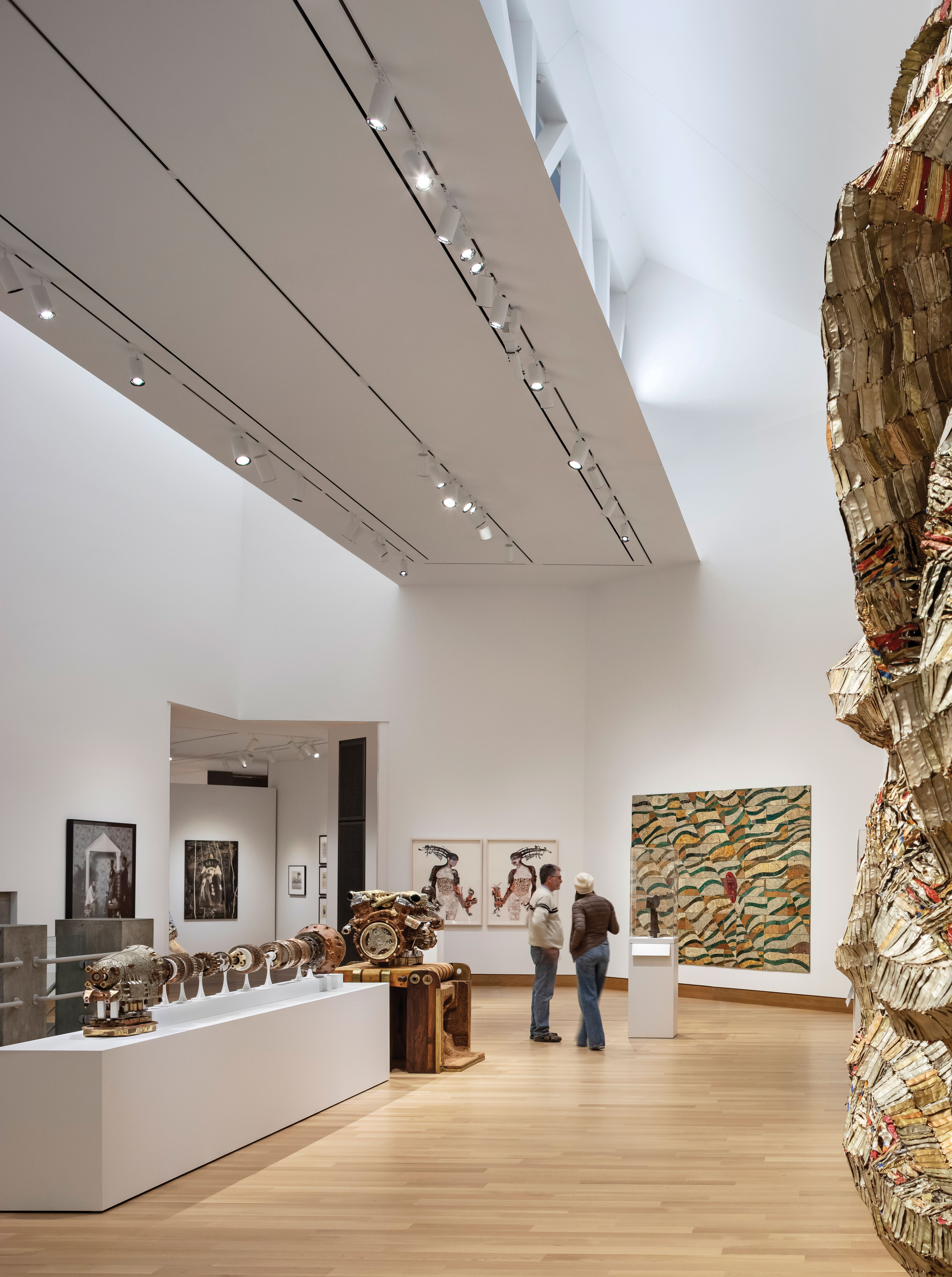
Here’s what you’ll see first in the new entrance gallery: a vibrant four-panel canvas by Nigerian artist Obiora Udechukwu. Titled Our Journey, the painting stretches 20 feet wide on the far wall, grabbing visitors by the eyes and pulling them in from the atrium. “It’s about diaspora and immigration, the journey of his own society and his own people,” Hart says. Visitors are more likely to have heard of the artist’s famous protégé, El Anatsui, whose well-known sculpture Hovor, made of aluminum bottle tops, hangs in an upstairs gallery. That placement was deliberate: “Not all the art you’re going to see here is familiar,” Stomberg says. “Not all great art is familiar art.”
“We believe that architecture shouldn’t mimic the past,” says architect Tod Williams. “Our building is trying to find complementary dialogue between old and new.”
In fact, when regular visitors walk into the new space for the first time, they may notice that some favorites are not on view. “Dartmouth uses this term ‘inclusive excellence,’ ” says Stomberg. “And the Hood Museum collection is a poster child for inclusive excellence. We have art from around the world, by men and women, young and old, Indian, Pakistani, American, Canadian, South American, you name it. If we put up only the greatest hits, we won’t demonstrate the diversity of the collection.”
He’d rather not reveal what’s been kept in storage. (“Can I allow it to just be discovered?” he asks.) He concedes one example: Sol Lewitt’s Wall Drawing #655, which has been associated with the Hood since the early 1990s. “If we put that back on that same wall where it’s been for 25 years, it wouldn’t be special,” Stomberg says. “But it will have a dramatic return: About a year and a half after we open, we will do a Sol Lewitt exhibition. The wall painting will be a part of it, and then it will stay.” In its place for the grand reopening? A student-curated show of photography focusing on the hot-button issue of consent.
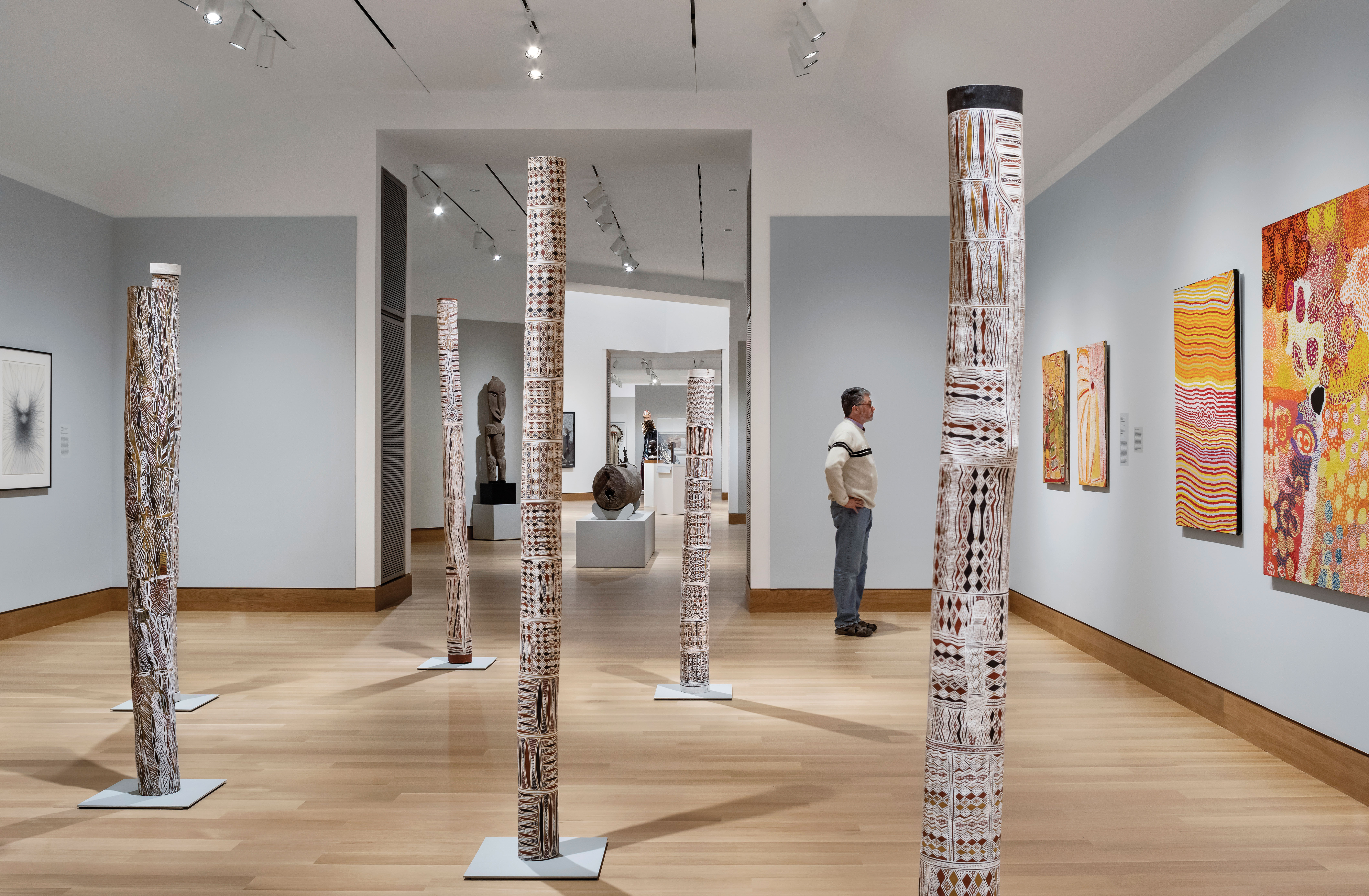
Disrupting narratives is a theme that unifies the new Hood, and it’s not just about what goes on display, but also about how and where. “Decisions regarding the larger stories we want to tell with our collections and the dialogues we want to spark were really important,” Bianco says. “What were we saying when we had ancient art next to European art, and now we have ancient art next to African art? That was important to us.”
The old Hood organized galleries around an outdated, simplistic trope: The first floor was devoted to permanent collection, the second to changing exhibitions. In the new Hood a rethought gallery flow will challenge visitors to question their assumptions. As an example, Bianco describes how museums often lump Egyptian art with classical Greek and Roman art. But, she says, “Egyptian art is African art. Egypt is on the continent of Africa.”
Now visitors will find a third-century stone carving of a pharaoh’s head—what Bianco calls a “bridge object”—deliberately placed between the ancient gallery and the traditional African gallery. It functions as a subtle prompt to think “about the biases we may have as Westerners that would prevent an interpretation of Egyptian art as African art,” she says.
This sort of thinking is at play in other parts of the museum. Highlights from the Hood’s extensive Native American collection, for example, spread across two galleries—one for contemporary work, the other for traditional—in an effort to subvert the outdated idea that Native American culture is frozen in time. Dominating the space is one of the museum’s most high-profile new acquisitions, a towering 2016 Jeffrey Gibson mixed-media figure, WHAT DO YOU WANT? WHEN DO YOU WANT IT?
THE BRICK TRIP
In many ways, the architects’ vision for the new Hood reflects the larger stories the museum is now telling with its collection. “We believe that architecture shouldn’t mimic the past or attempt to forecast the future but be so solidly in the present that it’s always in relationship to what went before,” says Tod Williams. “Our building is trying to find complementary dialogue between old and new.”
Perhaps the most visible way the Williams and Tsien design engages in that dialogue is with the exterior masonry. The long, horizontal off-white bricks were handmade by the Danish company Petersen using a firing process that results in color and textural variation. “The brick discussion went on, oh, my God, probably a year,” says Bianco. “We actually went on a brick trip: the architects, me, and some administrators.”
Packed into two cars loaded with masonry samples about the size of a coffee-table top, the group road-tripped to Princeton University and Pennsylvania’s Haverford College, where the architects had used Petersen brick in residence hall commissions. The group wanted to see how the materials looked in real-use situations, how they aged, and how they transformed in sunlight and shadow. “We brought these five huge, heavy samples and held every one up,” Bianco says. “Then we all stood back and compared.”
“The off-white was the hands-down favorite,” Stomberg says. The result is both bold and reverential. Set back on the Wheelock Street entrance plaza between the 19th-century Romanesque red-brick Wilson Hall and the 1962 modernist Hopkins Center, the elbows-out stance of the main exterior is softened by the texture and color of the brick. “It’s a visually mysterious material,” says Tsien. “The mortar and the brick are almost equivalent in terms of volume, and in a way there’s a dialogue between them just as there is between the existing buildings and the Hood.”
The brickwork continues into the atrium, where the new building merges seamlessly with the old. Through floor-to-ceiling windows at the south end, visitors can see the famous Charles Moore staircase with its theatrical landings and dramatic torchiere lights, which—along with all the galleries in the original building and signature Moore details such as oak baseboards and floating column capitals—has been painstakingly restored.
The final stretch before the museum opens to the public is a race to the finish. “This project has gone on for so long, and I’m so ready for it to be over,” says Bianco. “It’s still a daily process.” But the glitches, the brick trip, and those Tuesday curatorial meetings are all behind them. So is the controversy—at least for now. Ultimately, “It’s up to the critics,” Stomberg says. And it’s up to students, faculty, alumni, and visitors who, after all, will interact with the building and its art. “What we learned from practicing in our original facility has driven all of the decisions for this new one,” Bianco says. “We can only hope that what we learn [with the new space] is that there are yet more ways of engaging.”
Those ways of engaging are, of course, yet to be discovered. But one thing is certain: The Hood’s diverse collection is now more accessible and visible than ever. “We’ve worked to make sure that everybody’s cultural heritage is represented in this small museum with a global view,” says Stomberg. “I hope every Dartmouth student will find themselves reflected in the Hood.”
As for where they’ll find the Apache Pull-Toy? They’ll have to visit to see.
Leah Flickinger is a freelance writer based in Pennsylvania.
View a slideshow of images from the new Hood Museum here
The Stomberg 5
 Hood museum director John R. Stomberg names five Hood works that he “would love to live with forever.”
I am essentially a modernist. I respond naturally to abstraction and bold graphic forms. For this occasion I have allowed myself to go with a short list of pulse-quickening, personal favorites. The list has no relation to historical significance or to any of the many recognized hierarchies—implied and overt—that operate in the art world. These are five works of art that I would love to live with forever.
1. Triad-Brilliant (Passaic River), 1932 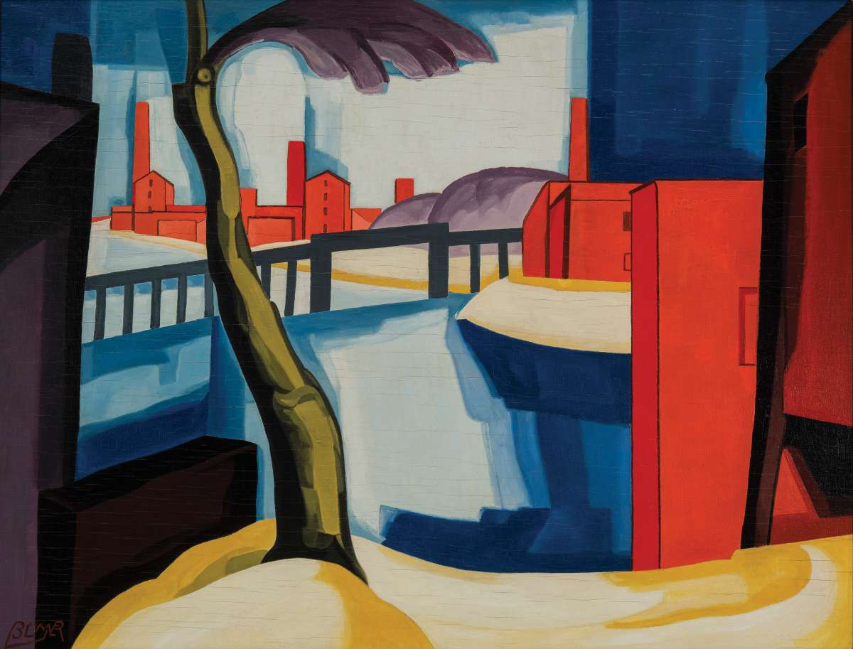
Oscar Bluemner
Oil on panel
Bluemner merged two typically different approaches in this painting: the hard edges and tight geometries associated with urban life—think of skyscrapers, rows of windows, even the grid of planned streets—and the looser, organic forms found in nature such as trees and rivers. The contrast ignites several interpretative journeys, notably about our relationship to the natural world during a period of rapid industrialization. Purchased through a gift of Evelyn A. and William B. Jaffe
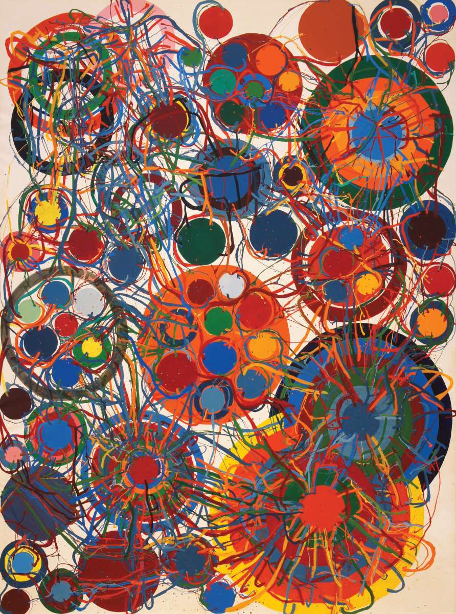 2. Work, 1966
Atsuko Tanaka
Enamel on canvas
The exuberance of this painting hits us first. I love the way the careful rendering of the circles and targets is overridden by the frenetic lines. And the colors—they are irresistible. Overall, I find this painting exciting, musical, and evocative of the electric age. Purchased through the Julia Whittier Fund
3. Big Daddy Paper Doll, 1968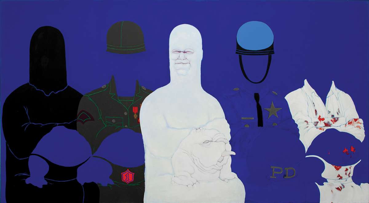
May Stevens
Acrylic on canvas
This painting shouts 1968 to me. It was painted at the height of a countercultural moment that included feminism along with antiwar and antiestablishment ideologies—not to mention a widespread adoption of vegetarianism. Here the artist’s father (outlined in white) stands in for all that is to be overthrown—the police, the military, the executioner, and the butcher. To achieve this, Stevens uses an icon of “girlhood” in the paper doll theme. Finally, she ensures we know the national context for her loaded icons through her use of red, white, and blue. Purchased through the Miriam H. and S. Sidney Stoneman Acquisition Fund and through a gift of Evelyn A. and William B. Jaffe
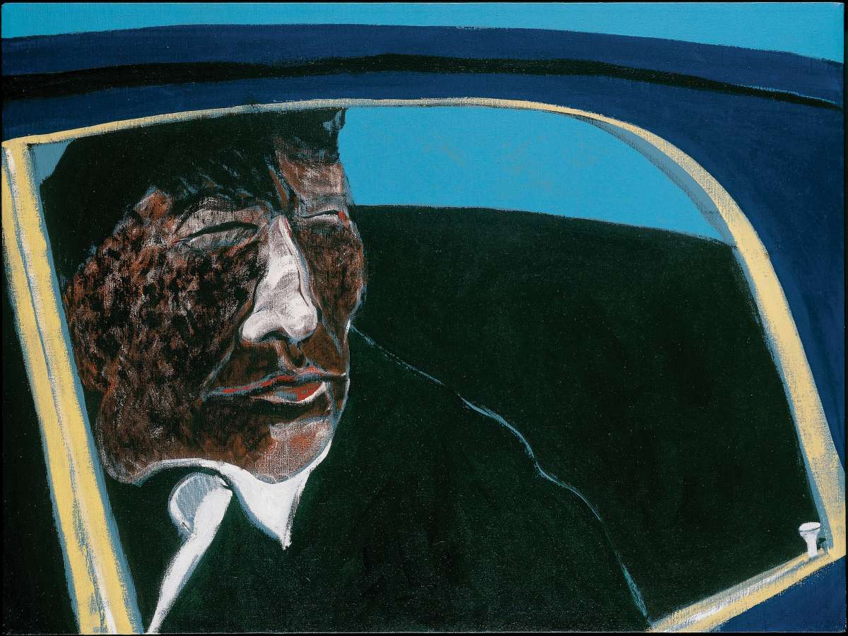 4. Drunken Indian in Car, 1974
Fritz Scholder
Acrylic on canvas
The somber tone of this painting haunts me. The man looks away in a manner I read as contemplative, leading me to wonder about his thoughts. Am I reading too much into it to see his expression as regret? The painter has given his subject tight quarters, reinforcing the idea that this man is once again bounded, contained, and restrained. The title clueing us in to his drunkenness adds a further level of social reality and pathos to the work. Gift of Jane and Raphael Bernstein
5. Yunyuli, 2002
Christine Yukenbarri Nakamarra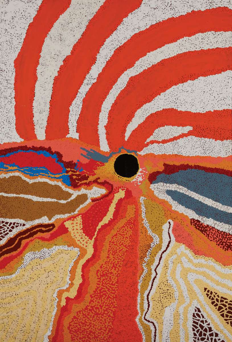
Acrylic on canvas
Though it’s abstract, I find strong suggestions of a landscape in this. Nakamarra, like both her parents, paints with dots of color closely aligned to suggest overlapping forms. The lines of the foreground race toward the black circle and then seem to explode upward through the orange streaks. There is excitement, energy, and a sense of responding to being in a particular—and well-loved—place. The vibrancy of her colors and the boldness of her composition provide endless fascination. Gift of Will Owen and Harvey Wagner
